Do you want to increase sales for your ecommerce store this year?
The answer is yes!
You’ll need a showstopping website that encourages people to stick around, browse your offerings, and—most importantly—make a purchase.
So, how can you ensure that your ecommerce website wows your customers and drives engagement?
Creating a better ecommerce experience is just a few steps away. Learn about eight strategies you can take advantage of right now to improve UX, drive sales, and energize your marketing approach.
Incorporate AI Into Your Shop Where Relevant
As we’ve discussed in our blog AI Strategy: Getting It Right When Everyone Else Is Doing It Wrong, you should take a strategic approach when it comes to AI. Instead of implementing every AI tool that exists, take a second and consider which areas of your ecommerce store need improvement.
Maybe your customer service team is getting lots of requests and you want to handle them more expeditiously. Or, maybe some products sell very well, but others could use a little more exposure.
AI can help in either of these scenarios—and many more.
AI Chatbots
With AI chatbot features, you can quickly answer common customer questions without taking time away from service reps. This service allows users to get answers fast without picking up the phone or typing out an email.
If an issue does require more time and expertise, the chatbot can redirect the customer to your live team when that makes sense.
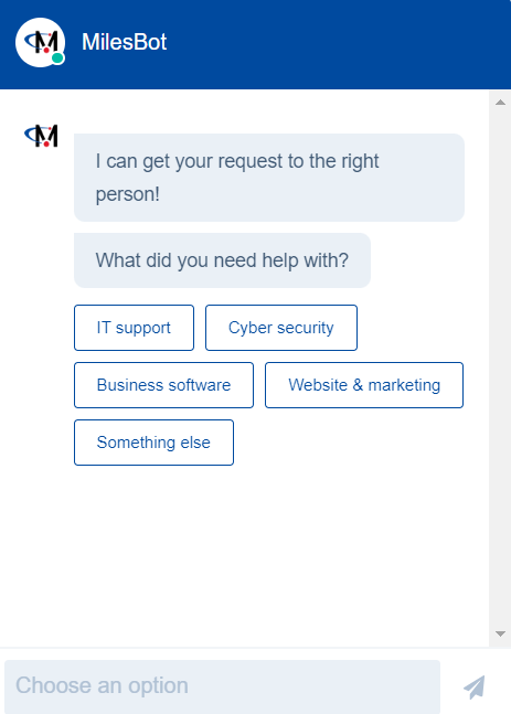
Chatbots also save time by obtaining relevant information related to user needs or problems. We use a chatbot on our website so we can help users get in touch with the right person quickly.

Another example is Etsy Support’s chatbot, which asks users various questions to gain relevant information about their issues. Before connecting them with a live support agent, the bot directs them to potential areas of resolution within the Help Center.
That way, the customer service team doesn’t waste time solving problems that could be remediated with a simple click.
In addition, AI chatbots can direct prospects to the appropriate products and pages on your website. This can be helpful if you have a large product catalog or highly niche solutions.
Recommended For You
By now, recommended product sections are ubiquitous on many large websites. They display similar products to help users find the best match and share adjacent products based on common user behaviors.
“Frequently bought together” is a valuable way to leverage AI and user preference information. For instance, when you buy a bag of tortilla chips on Amazon, they’ll suggest buying a jar of salsa to go with it.

The same is true if you try to buy peanut butter; Amazon suggests buying a box of crackers, thinking you may want to make peanut butter crackers.
This comes in handy if you have products that work well together or find that customers frequently buy certain goods at the same time.
Fraud Detection
Fraud can negatively impact any ecommerce business’s profit margins, credibility, and user experience. Fortunately, there are AI tools that can help recognize and minimize fraud to keep your customers and finances safe.
Because AI solutions can analyze data sets and recognize common patterns, they can also alert you when something is out of the ordinary.
For instance, if a user suddenly makes a large purchase from a random location, AI tools can mark the attempt as suspicious, allowing you to review it in more detail.
On the flip side, AI solutions can also learn the methods attackers use to make fraudulent transactions. From there, they can identify if user activity appears to match, and then send you an alert.
Take Advantage of Relevant Integrations
Ecommerce website integrations are a helpful way to improve data visibility and forecasting while reducing work for your team.
For instance, consider your inventory management system. By integrating this system with your website, you can track inventory in real time and update it automatically on your product pages. Besides saving time, it also creates a better customer experience by creating transparency if products are out of stock.
Your CRM is another helpful example. Connecting your CRM with your website allows you to easily track, understand, and take action on customer data.
Are certain users showing interest in a product, but dropping off before the purchase? You can automate follow-up emails to send based on their engagement and page view history (more on that later).
Another type of popular integration is payment gateways, which make it easy for customers to purchase from you using known payment methods. Forbes recently released a list of the top payment gateways categorized by business needs, including PayPal, Clover, and Stripe.
Other options include accounting, shipping, and ERP integrations to keep all areas of your business linked. Plus, connecting any of these platforms can give you better insights and improve reporting capabilities.
Optimize Your Site for Mobile Users
According to the Pew Research Center, over 75% of US shoppers use their smartphones to purchase products online.
As a result, your website has to be optimized for mobile users. A responsive design can help with this by scaling, minimizing, or hiding elements based on a user’s screen size.
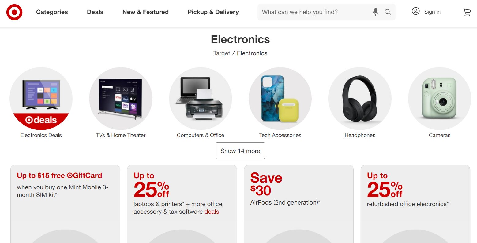
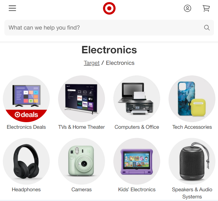
Take a look at Target’s website when browsing on desktop versus mobile.
In the desktop version, you can see all categories listed in the navigation, along with the search bar, account sign-in option, and shopping cart. It also shows a row of categories to explore.

On the other hand, the mobile view consolidates the navigation into a hamburger menu, providing a clean user experience and making it easy to tap into the category you want.
It also shrinks the number of categories per row so users don’t have to scroll and zoom in.

Another note is how the mobile version maps functionality to intuitive elements.
Take a look at the profile icon in the top right corner. In the desktop version, you can sign in to your Target account by clicking the icon next to the words “Sign in.”
The mobile view saves space by eliminating the words “Sign in,” assuming that users will know to click the profile icon to access their unique Target account.
Track Analytics and Take Action
Are you seeing a lot of abandoned shopping carts on your ecommerce site?
This is very common—in fact, almost 70% of online shopping carts are abandoned, according to the Baymard Institute.
There are a number of reasons why people don’t return to their carts, with the primary reason being extra costs like taxes or shipping fees. Other reasons include roadblocks in the purchase and delivery processes, like mandatory account creation and slow shipping.
Luckily, there are steps you can take to re-engage users who showed interest in your products but didn’t click “purchase.”
Setting up automated email workflows targeting specific users is one way to get back in front of your audience. By personalizing the message based on their product of choice, along with other details like the season of the year or upcoming holidays, you can encourage users to give your shop a second chance.
You can also send targeted emails based on recent page views and recommend relevant products to specific users.
Other strategies to reengage your audience include retargeting ad tactics, pop-up coupon forms, and product spotlights.
Understand The Power of Social Commerce
More and more users are buying products directly through Facebook, Instagram, and even TikTok.
Whether you’re ready to sell directly through these platforms or not, you can still use them to build credibility and drive traffic to your ecommerce site.
Research has shown that 76% of shoppers bought a product that was featured in a company’s social post.
Social media platforms are an excellent way to educate users about your products and showcase your brand in a human, helpful way.

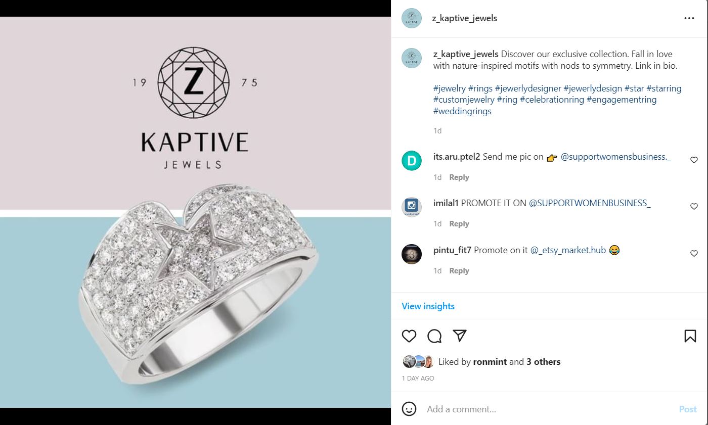
As this Instagram post shows, product spotlights and links can get your business in front of a wider audience and convince them to make a purchase.
Streamline the Checkout Experience
Say you’re heading to the grocery store to get ingredients for dinner. What would you do if you had to go through three different checkout lines, share your payment information multiple times, and set up a personal profile?
You might just give up and order pizza instead.
The same idea applies to your ecommerce store. Complex purchasing processes can deter online shoppers from buying; in fact, 17% of users abandoned their carts for that very reason.
As a result, creating a frictionless purchase process is essential to help users seamlessly check out. Amazon’s decision to offer a 1-click purchase in 1999 is a perfect example of a streamlined path to purchase.
Reviewing analytics can help you identify where users drop off in the purchase process. Do they leave your site during the account creation process? You could add an option to check out as a guest or reduce the number of fields required to create an account.
Or, do users drop off when they view shipping and handling fees? Providing estimates of these numbers early on might make it less of a surprise when they’re checking out.
Identify areas that add friction and consider ways to resolve them to help improve the path to purchase.
Review the Load Speed of Your Website
Another factor that can influence buying decisions is website load speed.
According to research, 50% of users will abandon their shopping cart if website pages aren’t loading quickly.
When your product pages don’t load, users aren’t going to stick around—they’ll go check out your competitors.
Google Search Console provides a Core Web Vitals report that helps you understand load speed information and take action on it. Some analytics you can review include the largest contentful paint, cumulative layout shift, and first input delay.
The largest contentful paint is the amount of time it takes for the largest content element to load on a webpage. Large elements are typically images, videos, or large block-level text. You’ll want to keep this number down to keep your site running smoothly.
Cumulative layout shift is the total of all individual layout shift scores for every unexpected layout shift that occurs on a page.
In other words, if page elements shift while a user is visiting a page, it creates a poor user experience.
Larger numbers mean there is more layout shift on that page, so you’ll want to keep that number low.
First input delay is the elapsed time from when a user first interacts with your page (clicking a link, call-to-action button, etc.) to when the browser responds to their interaction.
This is important in cases where the user needs to take a specific action, like clicking “Shop Now” or “View Cart.”
Why are these metrics important?
Google found that users were 24% less likely to leave a slow-loading page if the website followed Core Web Vital best practices.
Make sure that you optimize page load speed to keep users from leaving your site.
Showcase High-Quality Reviews
Imagine this scenario:
What if every time you went to the doctor, you never saw another patient there? Maybe the entire office was always deserted, except for one staff member. Or perhaps there were no credentials hanging on the walls.
You might find yourself feeling a little uneasy.
And if this continued, you might question the credibility of the practice.
The same idea applies to your online shop, too. Whether you’re in healthcare or ecommerce, trust matters. And when you’re selling products online, you can’t rely on an in-person presence to connect with shoppers and mitigate potential concerns.
As you’ve likely seen, most platforms let you display reviews right on the product page. Many restaurants now showcase reviews of dishes right on their menu page, as well.
Check out the Not Your Average Joe’s website as an example. Under each item on their menu, you can see reviews of each dish and explore further if you want to learn more.

By displaying reviews, you instill trust in buyers and let them know that you’re a credible company. Users may question the trustworthiness of an online store if there are zero customer reviews.
Optimizing Your Ecommerce Website Over Time
An impressive ecommerce website and strategy can be the difference between meeting your sales goals and falling short.
As trends change, you should assess your approach and make sure it meets your needs and customer preferences. By going the extra mile to provide a seamless and personalized shopping experience, you’ll show customers that you care, turning first-time visitors into repeat buyers.
Interested in exploring more ecommerce websites for inspiration? Check out our portfolio.


